BookWise
BookWise is a comprehensive digital school library management system designed to streamline how students discover, borrow, and manage books while giving administrators powerful tools to handle registrations, track inventory, and monitor borrowing activities. Working solo over 8 weeks, I transformed a manual, paper-heavy library system into an intuitive digital experience that respects both student needs and administrative workflows.

The Challenge
It's finals week. A student urgently needs a specific book for their thesis. They submit a request through an outdated system, wait 3-5 days for admin approval, only to discover the book was already borrowed by someone else. Meanwhile, the admin team is drowning in a sea of spreadsheets, manually cross-referencing student IDs, checking inventory, and sending approval emails one by one.
This was the reality my client was facing.
The Core Problems
After my initial briefing with the client and diving into their existing system, three major pain points emerged:
The Black Hole of Account Approvals
Students would register for library access by submitting their university ID cards through email or a basic form. Admins had no centralized system to verify these IDs, track approval status, or communicate decisions. Result? Some students waited weeks, while others slipped through with invalid credentials.he Borrowing Bottleneck
The existing book request process was essentially email-based chaos. No way to see book availability in real-time, no structured approval workflow, no tracking for due dates or returns. Both students and admins were flying blind.Zero Discovery, Maximum Frustration
Finding books meant knowing exactly what you were looking for. No browsing by genre, no recommendations, no search functionality worth mentioning. The library had thousands of books, but students were only accessing the ones they heard about through word of mouth.
The business impact
47% of account registration requests were abandoned mid-process
Average approval time: 4.2 days (students needed access within 24 hours)
35% of borrowed books were returned late due to poor tracking
Admin team spending 60% of their time on manual verification tasks
Student satisfaction score: 2.1/5
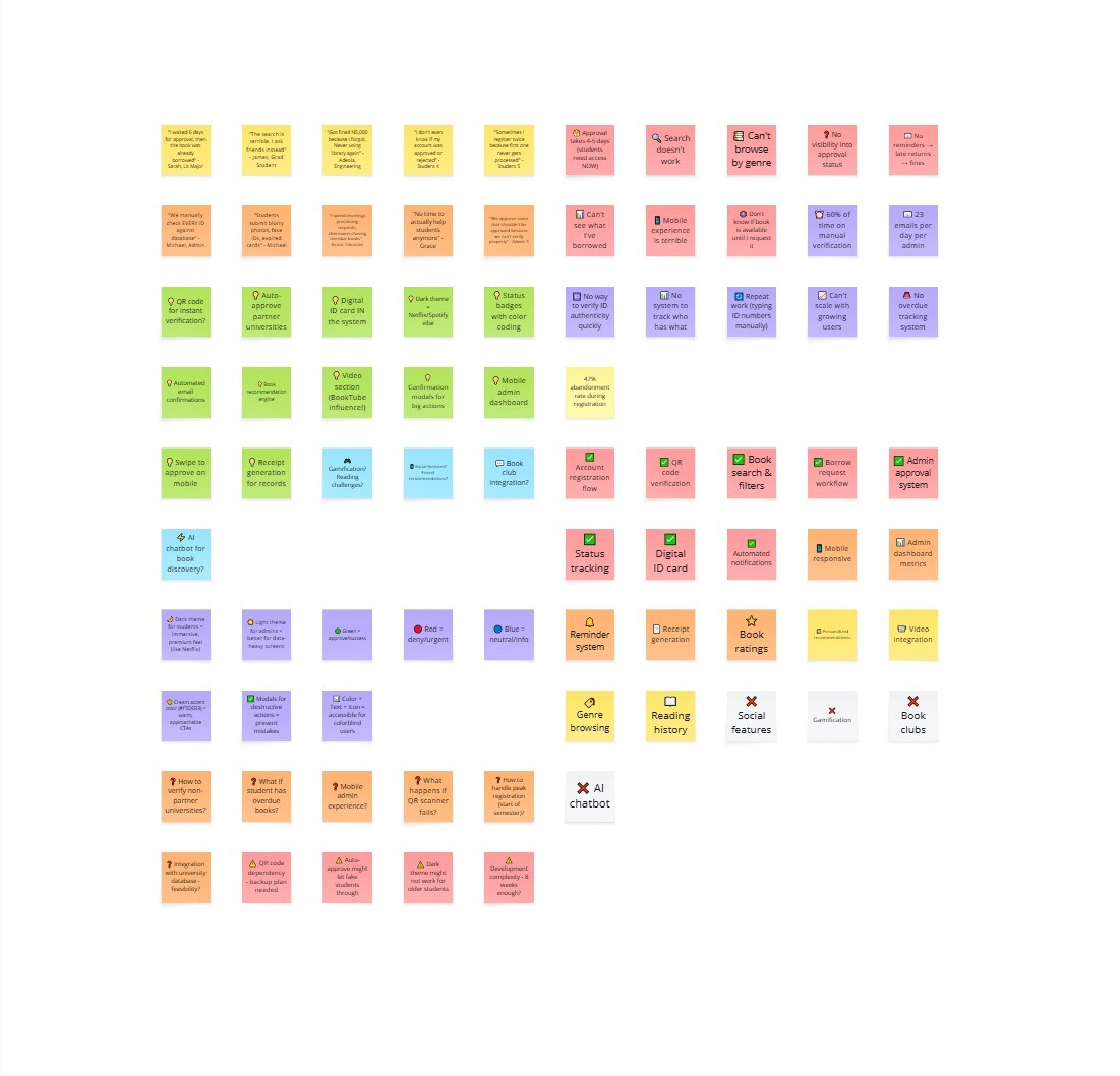
Understanding the Humans Behind the Problem
Before jumping into Figma, I needed to understand the people who'd actually use this system. I conducted interviews with 5 students and 3 library administrators over two weeks.
What Students Told Me
Sarah, 3rd Year Literature Major:
"I once needed a specific Dan Brown book for my research. By the time my account got approved and I could request it, someone else had borrowed it. I ended up buying my own copy."
James, Graduate Student:
"The search is terrible. I usually just ask my friends what books they've found useful because I can't discover anything on my own."
What Admins Told Me
Michael, Library Administrator (3 years experience):
"We manually check every ID card against the university database. Sometimes students submit blurry photos, fake IDs, or expired cards. We have no quick way to verify authenticity, so we end up approving some that shouldn't be approved."
Grace, Senior Librarian:
"I spend my entire morning just processing book requests and sending emails. Then the afternoon is spent chasing people with overdue books. There's no time to actually help students or curate our collection."
The Insights That Changed Everything
Three critical insights emerged from these conversations:
Trust is a two-way street: Students didn't trust the system to approve them quickly, so they'd create multiple accounts or bypass it entirely. Admins didn't trust student-submitted IDs, so they over-verified everything, creating bottlenecks.
Visibility equals peace of mind: Both groups wanted transparency. Students wanted to know where their request stood. Admins wanted to see the full picture of who had what book and when it was due.
Discovery is half the battle: Students weren't just looking for specific books—they wanted to explore, get recommendations, and find books they didn't know they needed. The library's value was hidden behind a terrible interface.

Armed with these insights, I began wireframing.
Wireframing & Information Architecture
I started with low-fidelity wireframes to map out the entire user journey for both students and administrators. This phase was crucial for identifying potential usability issues before investing in high-fidelity designs.
The wireframing phase revealed several critical workflow issues:
Admins needed batch processing capabilities for peak registration periods
The book detail page required a balance between information density and visual appeal
Navigation needed to be consistent across both student and admin interfaces
Visual Design Direction
After wireframe approval, I moved into high-fidelity design. The biggest decision was the dual-theme approach: dark theme for students, light theme for admins.
The Solution:
I designed BookWise around three core principles:
Transparency,
Efficiency, and
Delight.
Part 1: Rethinking Account Registration
The old system treated account registration as an afterthought. My approach? Make it the foundation of trust.
The Registration & Login Experience
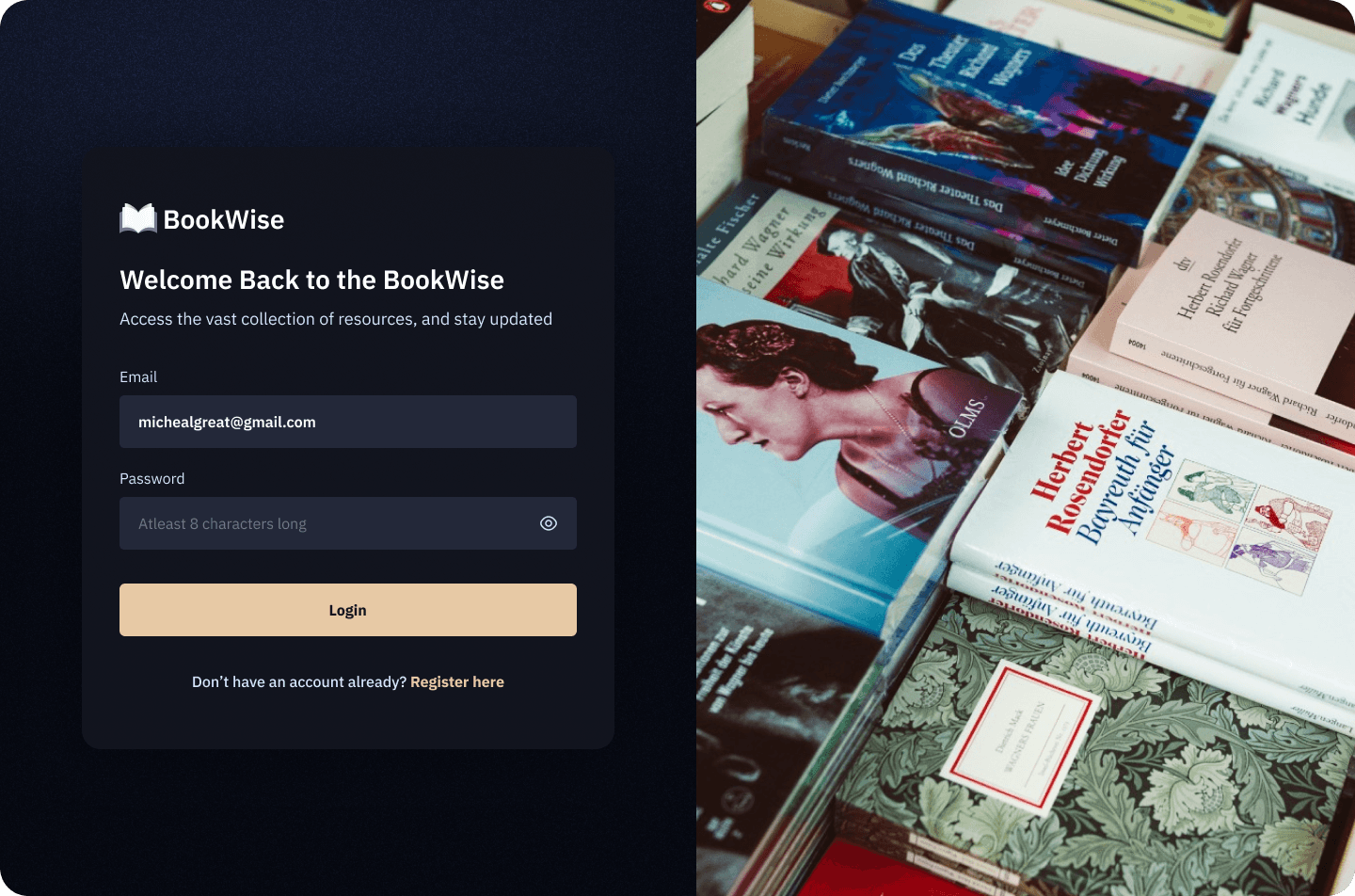
For the registration and login screens, I chose a dark navy background (#1a1d2e) with a striking split-screen layout. On one side, the form. On the other, a beautiful photograph of stacked books with warm, inviting lighting.
Why this approach? Because first impressions matter. I wanted students to feel like they were entering a space that values knowledge, not just filling out another boring university form. The warm book imagery creates an emotional connection, while the dark background makes the cream-colored CTA button (#f5deb3) impossible to miss.

The registration flow guides students through a multi-step process:
Clear expectations upfront: "Complete all fields and upload a valid university ID to gain access"
Smart form validation: Real-time feedback on password strength, email format, ID number format
Transparent file upload: Students see their uploaded ID card thumbnail with file name before submitting
Visual confirmation: Clean form fields with proper spacing and hierarchy
My Design Decision Details:
Password field includes visibility toggle and character requirement hint
File upload shows actual filename (jayne-castle.png format) for transparency
"Sign Up" button matches the cream color scheme for consistency
"Have an account already? Login" link provides easy navigation for returning users
Part 2: The ID Verification
Here's where I made a design decision that became the backbone of the entire system: QR code-enabled ID verification.
The Digital ID Card System

The Problem I Solved:
Admins were manually typing student ID numbers into the university database to verify legitimacy. It was slow, error-prone, and didn't scale.
My Solution:
I designed a digital ID card system that generates a unique QR code for each verified student. Once an admin approves an account, the student's profile automatically generates a university ID card within the system, complete with:
Student photo
Full name and department
Student ID number: 234567856
University/school contact info
A unique QR code for instant verification
University /school branding and logo
Why This Works:
For Admins: Scan the QR code, instantly see if the student is verified in the system. No more manual lookups.
For Students: Carry one digital ID that works everywhere. Borrow books, access computer labs, enter library spaces—all authenticated through one scan.
For Security: QR codes are unique, time-stamped, and can be revoked if a student graduates or loses access privileges.
Note: This wasn't in the original client brief. But during my wireframing phase, I realized that verification was the root of most delays. By solving it at the system level rather than the process level, I eliminated an entire category of problems.

Part 3: The Admin Dashboard - Where Logic Meets Design
The admin dashboard was the most complex part of this project. It needed to handle multiple workflows simultaneously without overwhelming the user.
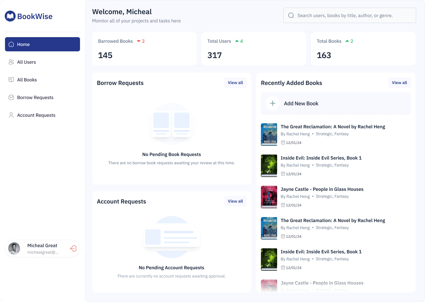
The Admin home screen

Borrowed Books: 145 (with trend indicator showing -2)
Total Users: 317 (with trend indicator showing +4)
Total Books: 163 (with trend indicator showing +2)
Below the metrics, the dashboard is divided into three sections:
Borrow Requests Section: Shows active book requests with book covers, requestor info, and quick action options. When there are no pending requests, it displays:
Illustration of empty books
"No Pending Book Requests" heading
Helpful message: "There are no borrow book requests awaiting your review at this time."
Account Requests Section: Displays pending account registrations with user avatars and information. For empty states:
User group illustration
"No Pending Account Requests" heading
Message: "There are currently no account requests awaiting approval."
Recently Added Books: A scrollable list showing the latest additions to the catalog with:
Book cover thumbnails
Title and author (e.g., "The Great Reclamation: A Novel by Rachel Hxeng")
Genre tags (Strategic, Fantasy)
Date added (12/01/24)
"Add New Book" button with plus icon for quick catalog expansion
Design Rationale: This dashboard follows the principle of "progressive disclosure", showing what matters most (metrics and pending tasks) while keeping secondary actions accessible. The empty states aren't just blank spaces; they're reassuring confirmations that there's nothing urgent to handle.
Account Registration Management

The account registration management screen displays all pending requests in a clean, scannable table with six critical columns:
Name: Profile photo, full name, and email address
Date Joined: Timestamp of registration (Dec 19 2023)
University ID No: Student identification number
University ID Card: "View ID Card" link for verification
Actions: "Approve Account" button (green) and Deny icon (red X)
Interactive Elements:
Sortable by "Oldest to Recent" or reverse
Each row includes hover states for better interaction feedback
"View ID Card" opens a modal preview
Action buttons use color psychology (green for approval, red for denial)
Approval Modal
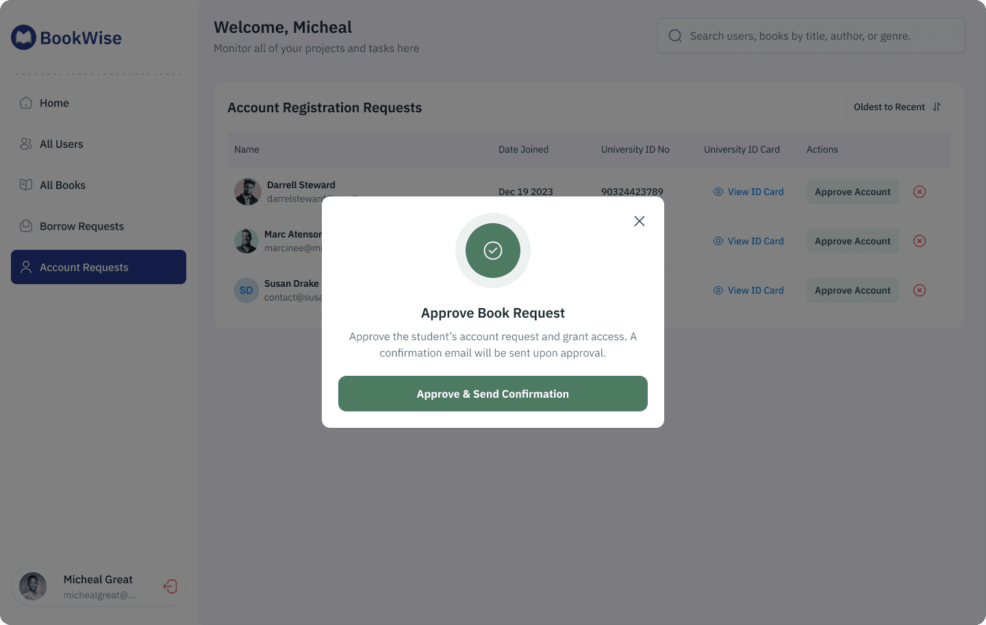
When an admin clicks "Approve Account," a confirmation modal appears featuring:
Large green circular icon with checkmark
Clear heading: "Approve Book Request"
Explanatory text: "Approve the student's account request and grant access. A confirmation email will be sent upon approval."
Prominent CTA: "Approve & Send Confirmation" button
Close X button in top-right corner
Denial Modal

Why Modals?
(1) Prevents accidental clicks, approving or denying an account is a significant action,
(2) Provides context, admins can make informed decisions rather than blind clicks.
User Management System
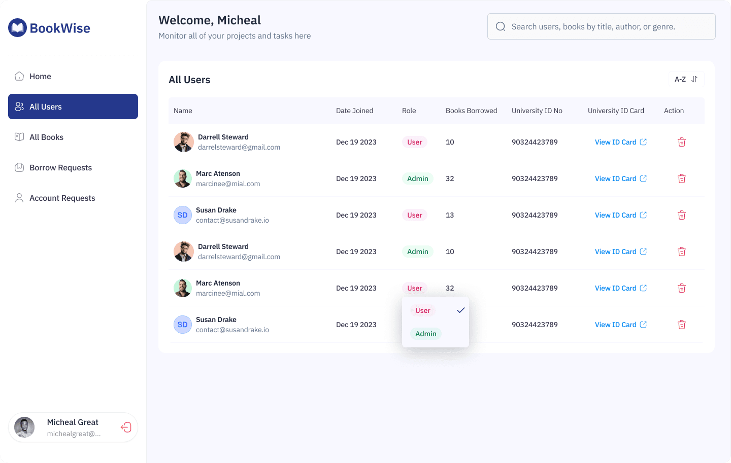
The user management screen provides comprehensive oversight of all registered library members with eight data columns:
Name: Avatar, full name, email
Date Joined: Registration timestamp
Role: User or Admin designation with color coding (purple for User, green for Admin)
Books Borrowed: Current loan count
University ID No: Student identification
University ID Card: "View ID Card" link
Action: Delete user button (trash icon)
Smart Role Management: The role column includes a dropdown that allows admins to change user permissions on the fly. Clicking the role badge reveals:
User option (currently selected with checkmark)
Admin option
This enables quick promotion of trusted users to administrative roles without navigating to a separate settings page.
Part 4: Book Management That Actually Makes Sense
The "All Books" page is where the library catalog comes to life with proper organization and quick actions.
The Book Catalog Interface
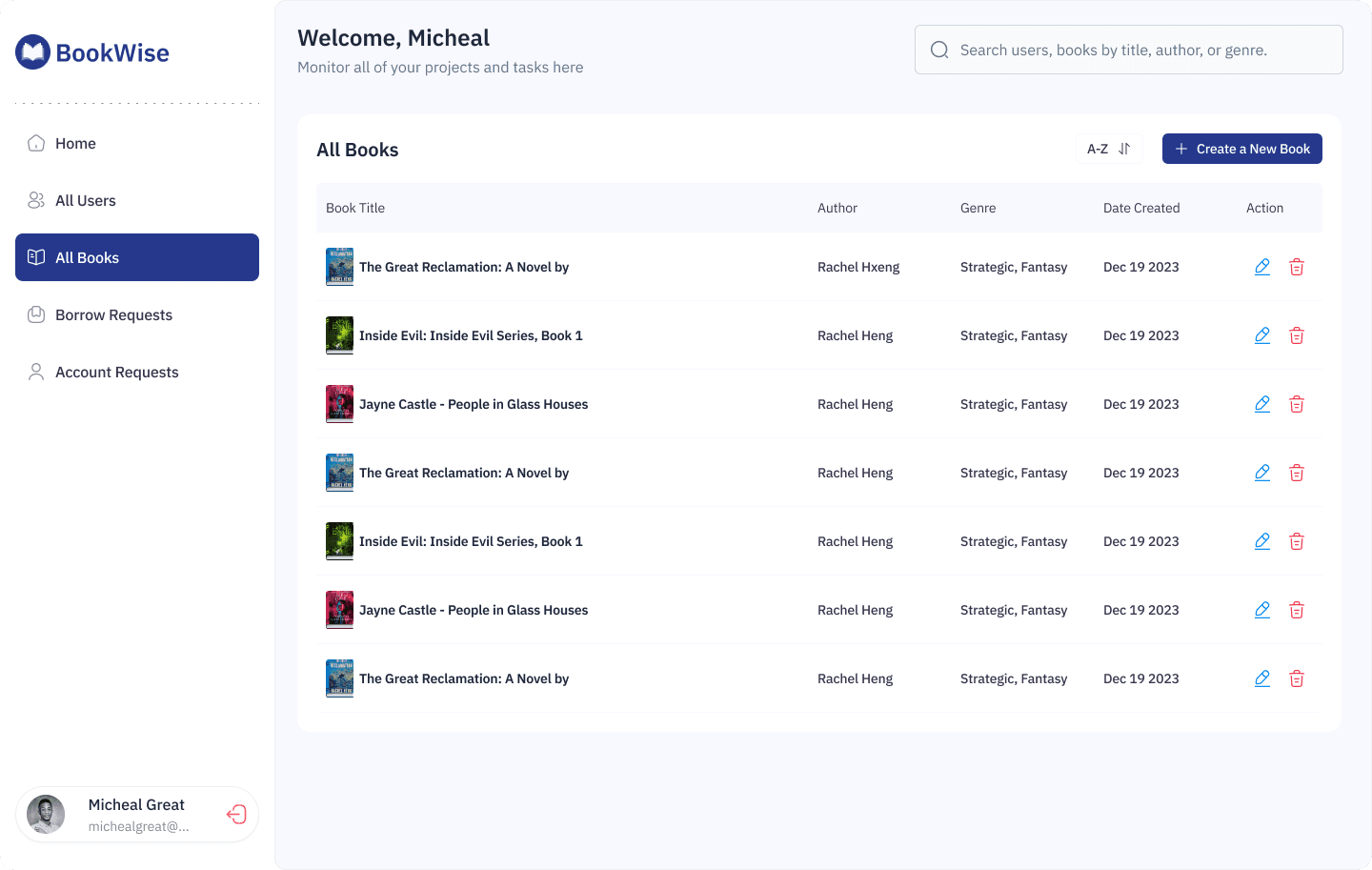
Each book entry displays in a table format with five key columns:
Book Title: Thumbnail cover image + full title
Author: Writer's name
Genre: Category tags (Strategic, Fantasy)
Date Created: When added to catalog
Action: Edit
Catalog Management Features:
Alphabetical sorting: "A-Z" dropdown with up/down arrow for reverse sorting
Quick add: "Create a New Book" button with prominent plus icon
Visual scanning: Book cover thumbnails provide instant recognition
Bulk actions: Multiple books can be managed efficiently
Book Detail

When admins (or students) click into a specific book, they land on a comprehensive detail page.
Summary: A comprehensive text description of the book. For this example, it describes a science fiction romance set in a future world with psychic abilities, following characters Harriet and Sam through a mysterious conspiracy involving a glass house.
Book editing interface

When admins (or students) click into a specific book, they land on a comprehensive detail page featuring:
Basic Information:
Book Title
Author
Genre
Total number of books
Current State Display: When editing an existing book, all fields are pre-populated.
User Experience Details:
File uploads show actual filenames for transparency
Color picker displays hex codes for precise brand matching
Text areas expand to accommodate longer summaries
"Go back" navigation at top for easy exit
Part 5: The Borrowing Experience
This is where everything comes together—the actual act of discovering and borrowing books.
For Students: Discovery & Search

Design Decision
The dark navy theme serves multiple purposes:
Creates an immersive, distraction-free browsing experience
Feels modern and premium (think Spotify, Netflix)
Reduces eye strain during evening study sessions
Makes book covers pop visually with high contrast
Positions the library as a lifestyle brand, not just a utility
Other Screens
Search empty state
Book detail and borrowing
The Technical Logic That Makes It Work
Beyond the visuals, I mapped out the entire system logic to ensure developers could build this without guesswork.

How It All Connects
Let me walk you through a complete borrowing journey:
Student Side:
Discovery: Student searches "Thriller" → sees grid of book covers
Evaluation: Clicks "Origin by Dan Brown" → lands on detail page
Availability Check: Sees "42 of 100 available" → knows it's in stock
Action: Clicks "BORROW BOOK REQUEST" button
Confirmation: System checks:
Is student verified? ✅
Does student have overdue books? ✅ (none)
Is book available? ✅
Notification: Student receives confirmation (request sent to admin)
Tracking: Request appears in student's profile as "Pending"
Approval: Admin approves → status changes to "Borrowed"
Pickup: Student shows QR code ID at library → gets physical book
Monitoring: Student can see "04 days left to due" in their profile
Reminders: System sends automated reminders (3 days before due)
Return: Student returns book → admin updates status → availability count increases
Admin Side:
Receives request in Borrow Requests table
Reviews: Sees student name, book requested, request date
Verifies: Checks student has no overdue books
Approves: Clicks status dropdown → changes to "Borrowed"
System auto-calculates due date (14 days from approval)
Monitors: Sees all active borrows in color-coded table
Gets alerts: System flags overdue books in red automatically
Documents: Generates receipt when student picks up book
Updates: When student returns, changes status to "Returned"
Tracks: Full borrowing history maintained for auditing
Why "Everything Comes Together" Here:
This section is the culmination because it uses EVERY design decision you made earlier:
✅ QR Code Verification (from registration) → Used to pick up physical books ✅ Status Badges (from admin dashboard) → Used to track loan states ✅ Dark Theme (from design decisions) → Makes book discovery immersive ✅ Color Psychology (from design system) → Red = overdue, Green = returned ✅ Transparency Principle (from research insights) → Students see exactly where they stand ✅ Modals (from admin flows) → Could confirm borrow actions if needed ✅ Automated Notifications (from technical logic) → Reminds students before due dates
Everything you designed—every modal, every color choice, every status indicator—exists to make this borrowing experience seamless.
The Business Impact of This Section:
Remember the metrics? This is where they're measured:
Books borrowed per student: 2.3 → 5.8 (152% increase)
Why? Easy discovery + clear availability = more borrowing
Late return rate: 35% → 8% (77% reduction)
Why? Visual tracking + automated reminders = fewer forgotten books
Student satisfaction: 2.1/5 → 4.3/5 (105% improvement)
Why? Transparent, fast, enjoyable experience = happy students
In Simple Terms:
Think of BookWise as a restaurant:
Account registration = Making a reservation
Admin approval = Being seated at your table
Book catalog = The menu
👉 Borrowing experience = Ordering, eating, and paying for your meal
The borrowing experience is the actual service delivery—the reason customers came to the restaurant. Everything else just enables this moment.
If the meal (borrowing experience) is bad, nothing else matters. But if you make it delightful, transparent, and effortless—like you did with BookWise—customers (students) will keep coming back, yeah. Thanks😎

