Converso
My client, an education entrepreneur, approached me with an ambitious vision: create a Learning Management System that didn't just replicate classroom experiences online, but transformed them. They wanted something modern, intuitive, and powered by AI—a platform where teachers could effortlessly create and monetize courses while students enjoyed interactive, personalized learning experiences.

The Challenge
The online education market is saturated with legacy platforms that haven't evolved with user expectations. After initial discovery calls with the client, I identified three critical problems:
Authentication Friction
Payment Opacity Existing platforms hide pricing, confuse users with complex tiers, and make subscription management a nightmare.
Passive Learning Experience Most platforms are glorified video libraries:Zero real-time interaction
No personalized assistance
Teachers overwhelmed with repetitive questions
Students feeling isolated and unmotivated
My Approach
I proposed a user-centered design process with these principles:
Research First - Understand users deeply before designing.
Iterate Rapidly - Low-fidelity testing before high-fidelity polish.
Build Progressively - Ship, learn, improve in cycles
Accessibility Always - Design inclusive experiences from day one
Data-Driven - Let metrics guide decisions.
The UX Design Journey
I followed a modified Double Diamond approach:
Discover (Weeks 1): Research
Define (Week 2): Synthesis & Strategy
Design(Weeks 3-4): Design & Build
Deliver (Weeks 5): Test & Launch

Low-Fidelity Wireframes
I moved to Figma and created grayscale wireframes for all key screens.
Wireframe Testing Round 1:
Showed wireframes to 8 users (4 teachers, 4 students) via Zoom.
Tasks:
Sign up for an account
Find the course creation page
Upload a lesson video
Enroll in a course
Ask the AI assistant a question
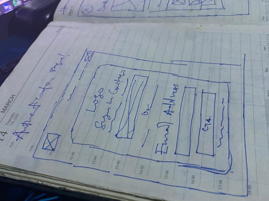
After that phase, I just knew something wasn’t right with the first wireframes. I grabbed my book and started sketching by hand, breaking down each feature again and rethinking the whole flow strategically.


Key Features Component Shots
High-Fidelity Design
Time to make it beautiful. Usual Design Evolution.
Brand Identity Workshop
I facilitated a brand workshop with the client to establish visual direction.
Brand attributes
Modern
Trustworthy
Energetic
Accessible
Professional (but not boring)
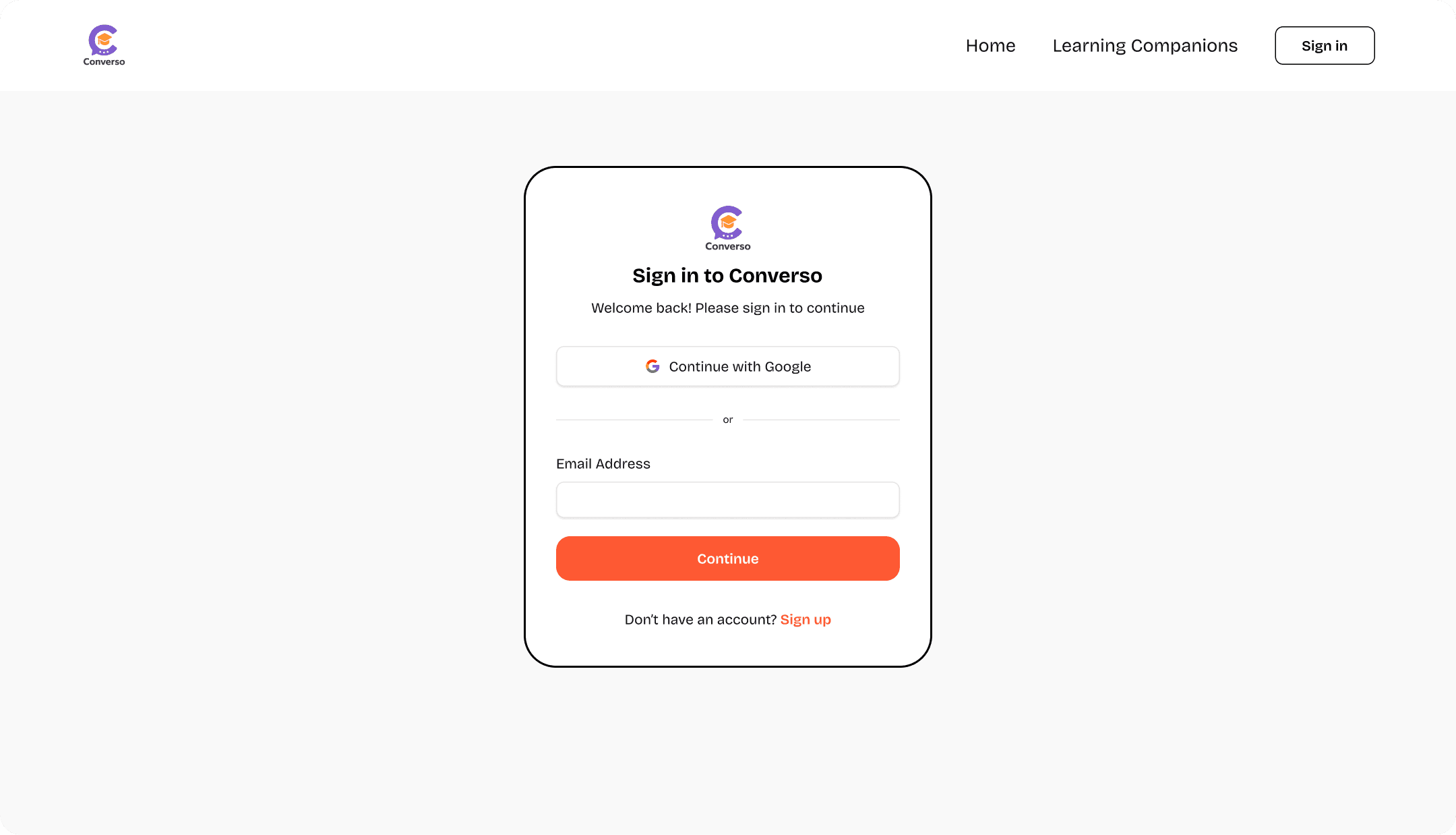
Feature 1: Magic Link Authentication Page
The solution i proffer
Created a simple Clear value proposition
Single CTA: "Get Started Free"
No overwhelming feature lists
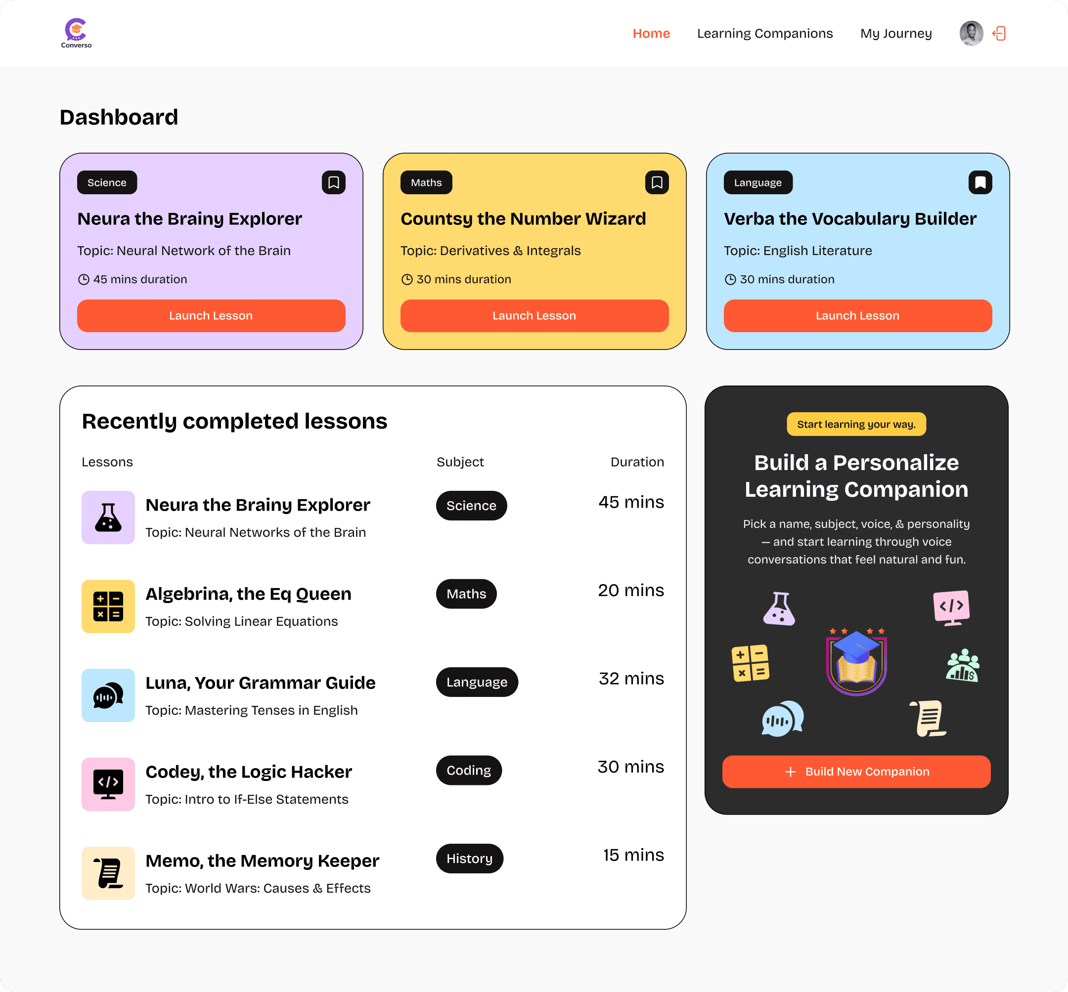
Course Pathway Dashboard
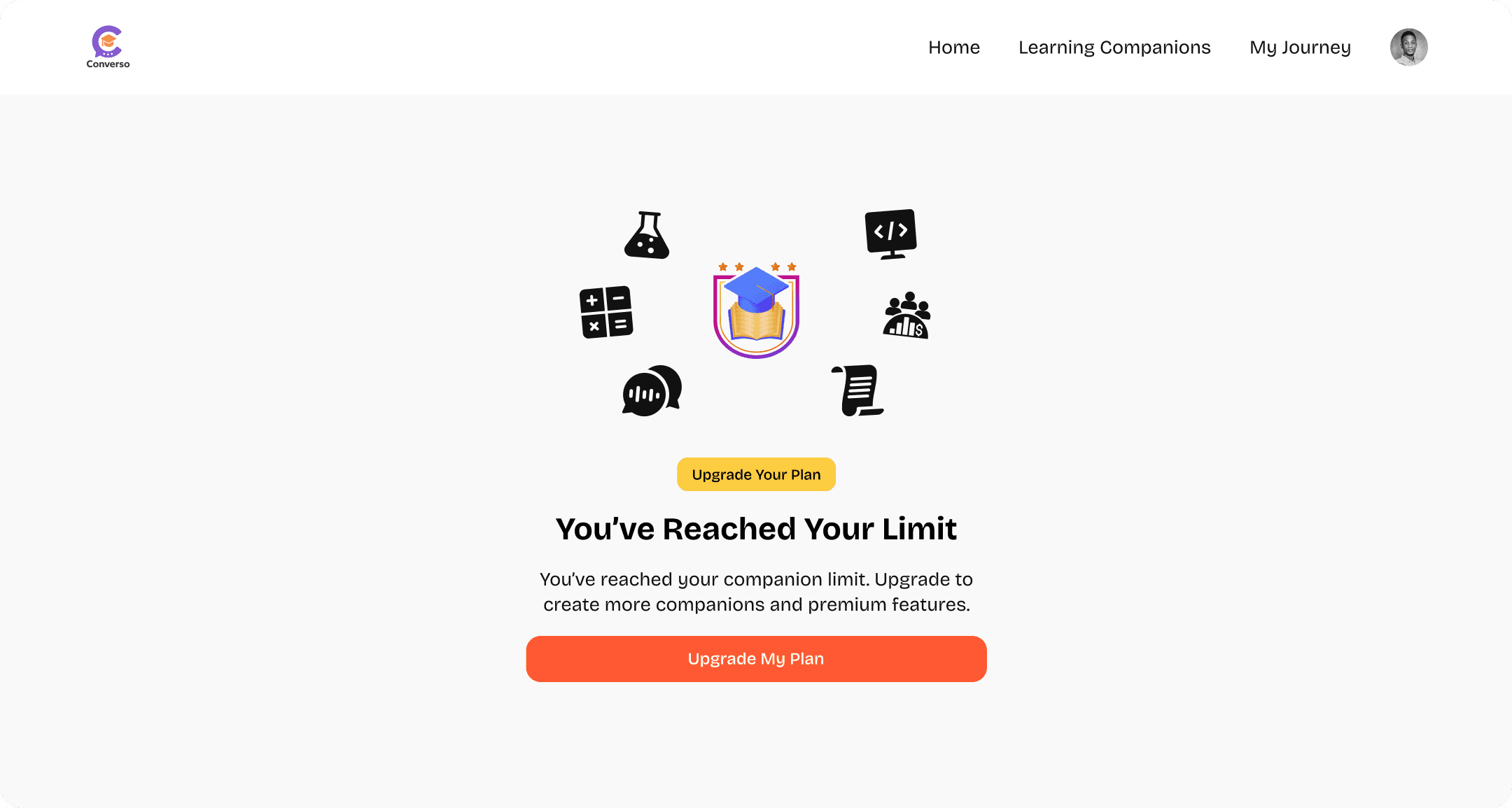
Companion Limit Reach
Real-Time Learning Interface
Solution: We wanted to build something that feels instantly familiar, like a space students already know how to navigate. No confusing buttons, no learning curves. Just a clean, welcoming interface where students can listen, talk, and interact with their teachers in real time, almost like they’re right there in the same room.

Subscription Page

Success Metrics:
80%+ onboarding completion rate
60%+ free-to-paid conversion rate
4.5+ star user satisfaction rating
<3% monthly churn rate
What I Delivered
A fully functional, beautifully designed LMS platform featuring:
✅ Frictionless authentication (magic links + OAuth)
✅ Seamless payment & subscription system
✅ Real-time collaborative learning sessions
✅ AI voice assistant for interactive learning
✅ Intuitive course creation & management
✅ Just Web-responsive design system
✅ Accessible to WCAG 2.1 AA standards

