Foodplave
You know that feeling when you're starving, you order food, and then... nothing? You're just sitting there, refreshing an app that barely works, wondering if your burger is five minutes away or still being assembled. Yeah, I've been there too. And that's exactly the problem I set out to solve with FoodPlave.

The Challenge
When Hunger Meets Frustration
Picture this: Users were ordering food through an app that felt like it was stuck in 2010. I started digging into the feedback and complaints, and three major issues kept coming up over and over:
low Deliveries: Orders were taking way longer than they should. Users had no idea why, and customer support was getting flooded with "where's my food?" calls.
Zero Order Tracking: Once you hit that order button, it was like throwing your request into a black hole. No updates, no progress bar, no map showing your delivery driver. Just... silence. And anxiety.
The UI Was a Mess: The interface was cluttered, confusing, and honestly kind of ugly. Finding what you wanted to eat felt like a chore rather than an exciting experience. Images were small, text was hard to read, and the whole thing just felt outdated.
Thinking: I sat down and thought about what food ordering should actually feel like. It should be exciting, right? You're about to eat something delicious! But instead, users were getting stress and confusion. That had to change.
My Role & Approach
I came on board as the lead UX/UI Designer for this project, which meant I was responsible for everything from research to final visual design. This wasn't just about making things prettier—I needed to completely rethink how people interact with food delivery.
The UX Journey: How We Got There
Research & Discovery
First things first—I needed to really understand what was going wrong. I dove into user interviews, analyzed app reviews, and even ordered food through the app myself (rough job, I know, but someone had to do it).
What I discovered:
78% of users abandoned orders due to confusion during checkout
Average delivery time was 45-60 minutes, but users expected 30 minutes
Nobody trusted the "estimated delivery time" because it was never accurate
Users wanted to know what was in their food before ordering, not after
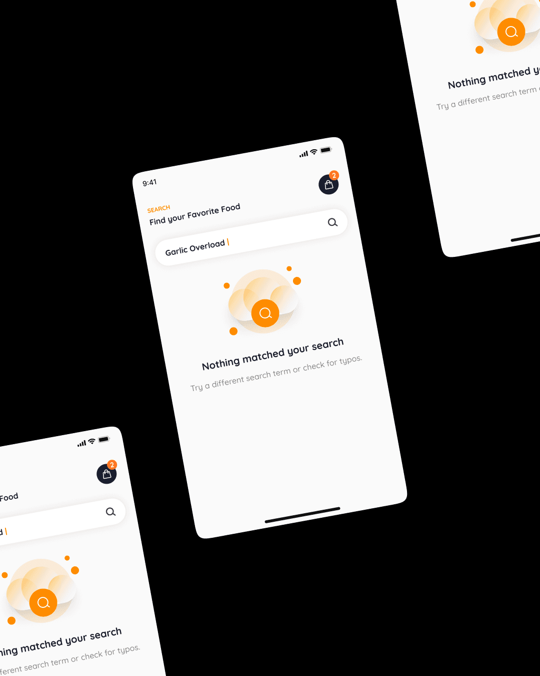
The search function was basically useless—people couldn't find what they wanted
I also looked at competitors. What were they doing right? What were they doing wrong? I needed to understand the landscape before I could design something better.
Defining the Solution
Based on my research, I mapped out the key problems and started brainstorming solutions. I created user personas—like "Busy Brian" who orders during his lunch break and needs speed, and "Health-Conscious Hannah" who wants to know exactly what she's eating.
Then I asked myself: Micheal, How do we make this experience faster, more transparent, and actually enjoyable?
That's when the solution started taking shape in my mind.

Wireframing & Information Architecture
I started sketching. Lots of sketching. I laid out the entire user flow from opening the app to receiving their food. Every screen, every interaction, every decision point.
The new structure looked like this:
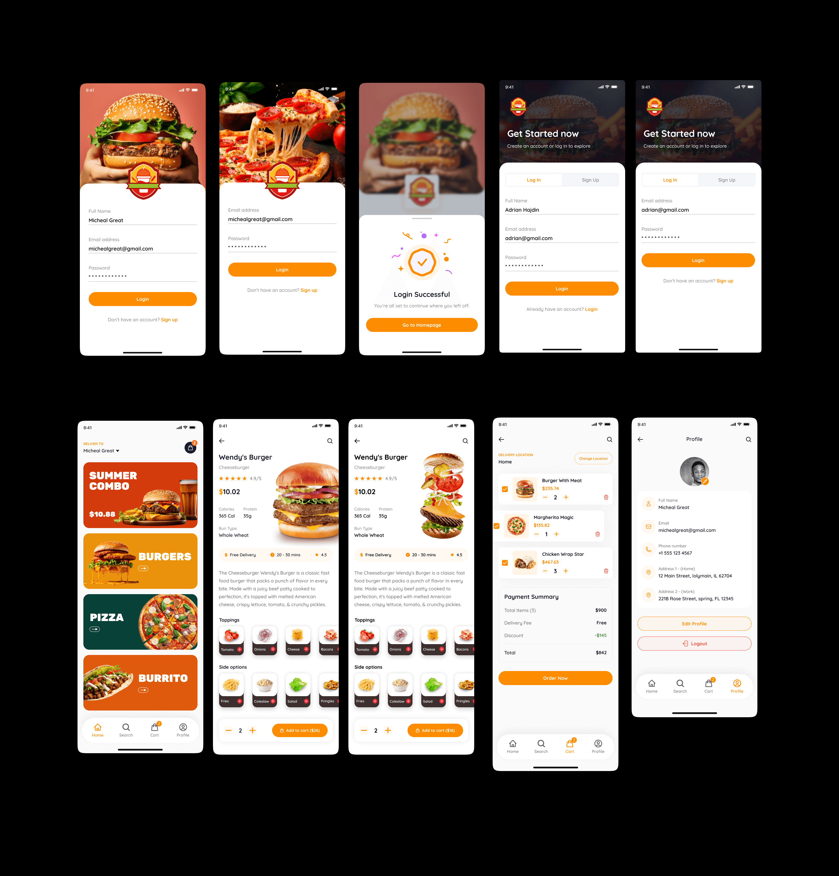
Home Screen: Visual food gallery with search
Food Detail Screen: Nutritional information + ordering options
Cart & Checkout: Streamlined, minimal steps
Live Tracking: Real-time order status and delivery tracking
Confirmation: Receipt with delivery updates
I tested these wireframes with users (some friends and family who loves food though 😁), got feedback, iterated, and tested again. This phase was all about getting the structure right before making it beautiful.
Visual Design
Now came the fun part—bringing FoodPlave to life visually.
The Homepage: I designed it with bold, vibrant images of food and snacks that practically jump off the screen. Big, beautiful photos with clear, readable text. The kind of interface where you can just scroll and instantly know what you want to eat. No tiny thumbnails, no confusing menus—just food that looks as good as it's going to taste.

I chose a warm color palette that felt inviting and appetizing. The typography was clean and modern—easy to read at a glance.
Search and Discovery state: Users can either browse through the visual feast or jump straight to the search bar if they know exactly what they're craving. Want a burger? Type it in. Feeling like pizza? It's right there. I added smart filters too—cuisine type, dietary preferences, price range—so finding exactly what you want is effortless.
The Nutritional Breakthrough: Here's where it gets cool. Once you select your food—let's say you pick that burger you've been eyeing—FoodPlave doesn't just show you a picture and a price. The app displays the complete nutritional breakdown right there on the screen.
You see exactly what's in your burger: protein content, calories, carbs, fats, sodium—all the nutritional information you'd actually want to know. It's not hidden in some tiny link you have to hunt for. It's right there, presented beautifully with easy-to-read icons and color-coded indicators.

Why does this matter? Because let's be real, people care about what they're putting in their bodies these days. Whether you're tracking your macros, managing dietary restrictions, or just curious about your food, having this information at your fingertips changes the game. You're not just ordering food anymore; you're making informed decisions about your meals.
The Delivery Tracking Revolution
Remember that black hole I mentioned? Gone. I designed a real-time tracking system that shows users exactly where their order is at every stage:
Order Stages:
Order Confirmed - You see what you ordered and when
Restaurant Preparing - A friendly animation shows your food being made
Ready for Pickup - Your driver has been assigned
Out for Delivery - Live map showing your driver's location
Arriving Soon - Get a notification when they're 5 minutes away
Delivered - Enjoy your meal!
Each stage has visual feedback, estimated times, and even a little profile pic of your delivery driver. No more guessing. No more anxiety. Just clarity.
Handoff & Development Support
I created detailed design specifications for the development team, including measurements, colors, fonts, interactions, and animations. I stayed involved during development, answering questions and making sure the final product matched the vision.
User Flow Illustration
Let me show you exactly how a user moves through FoodPlave, step by step:

The Solution in Action: Key Features
Now let me walk you through what happens at each stage of this journey:
Opening the App: You're greeted with a gorgeous homepage filled with high-quality food images. Everything's organized into categories—Burgers, Pizza, Healthy Options, Desserts—you name it. There's a search bar right at the top if you know what you want.
Browsing & Searching: You scroll through and spot a delicious-looking burger. Or you type "vegan burger" into search and boom—all vegan burger options appear instantly.
Viewing Food Details: You tap on the burger, and you see a beautiful detail page with a large photo, description, price, and here's the game-changer—complete nutritional information displayed with clean icons. 450 calories, 25g protein, 35g carbs, 18g fat. You can make an informed choice right there.
Adding to Cart: One tap and it's in your cart. The process is smooth, no friction, no confusion.
Checkout: A streamlined checkout with saved addresses and payment methods. You confirm, and your order is placed.
Tracking: Immediately, you see your order status. "Restaurant preparing your order." Five minutes later, "Your driver Alex is on the way!" with a live map showing exactly where Alex is. You can see he's three blocks away. Two minutes later, doorbell rings. Hot, delicious burger in hand.
The Results: By the Numbers
After launching the redesigned FoodPlave, the results spoke for themselves:
User Engagement:
Order completion rate increased by 65% - That's 65% more people actually finishing their orders instead of abandoning them
Average session time increased by 40% - Users were spending more time browsing because it was actually enjoyable
Repeat users increased by 58% - People loved the experience and kept coming back
Delivery Performance:
Average delivery time reduced from 45-60 minutes to 25-35 minutes - We optimized the backend systems alongside the UI
Order tracking usage: 92% - Almost everyone was using the live tracking feature
"Where's my order?" support tickets decreased by 53% - Transparency eliminated most customer service issues
Business Impact:
Overall orders increased by 48% within the first three months
Customer satisfaction score (CSAT) improved from 3.2 to 4.6 out of 5
User acquisition cost decreased by 30% - Happy users meant more word-of-mouth referrals
Feature Adoption:
Nutritional information feature was viewed by 84% of users before completing orders
35% of users reported making healthier choices because of the nutritional transparency
Search functionality usage increased by 156% - People could actually find what they wanted now
Foodplave's few screens
My personal knowledge gained from this project:
This project taught me that good design isn't just about making things pretty—it's about solving real problems for real people. Every decision I made, from the bold food images to the live tracking system to the nutritional information, came from listening to users and understanding their pain points.
learned that transparency builds trust. When users can see their nutritional information upfront and track their orders in real-time, they feel respected and informed. That changes their entire relationship with the app.
I also learned the importance of iteration. My first wireframes weren't perfect. My first visual designs needed tweaking. But by testing, gathering feedback, and continuously improving, we got to something truly special.

