Mojito
Velvet Pour came to me with a challenge: their website wasn't converting, and users were struggling to find what they were looking for. In just three weeks, we transformed their digital experience from frustrating to delightful, and the results spoke for themselves—increased engagement and a significant boost in ROI.

Project Overview
You know that feeling when you're craving a specific cocktail, but you can't quite remember the recipe? That's exactly what users were experiencing on Velvet Pour's website. What started as a simple redesign request turned into a fascinating journey of understanding what cocktail enthusiasts really need when they're looking for their next perfect drink.
The Problem
Let me paint you a picture. Velvet Pour had a cocktail website, but here's the thing—users couldn't easily find the cocktails they wanted. Imagine being excited to make a mojito for your Friday night gathering, landing on the website, and then... feeling lost. Where do you start? How do you search? What if you don't know the exact name?
The data told us a clear story: conversions were low. People were coming to the site, but they weren't sticking around. They weren't finding what they needed, and worse, they were leaving without engaging with the content.
The real problem wasn't just about aesthetics or a few misplaced buttons. It was deeper than that. The website wasn't speaking the language of cocktail lovers. It wasn't anticipating their needs or making their journey intuitive.
The Solution
Here's where things got exciting. Instead of just slapping on a fresh coat of paint, we decided to redesign the entire website with the user at the center of every decision.
The solution wasn't about adding more features—it was about making the right features work beautifully together. We needed to create an experience where finding a cocktail felt as smooth as sipping one. An experience where users could explore, discover, and get inspired without friction.
We rebuilt the website from the ground up, focusing on:
Intuitive navigation that makes sense to cocktail enthusiasts
Visual hierarchy that guides users naturally
Content that speaks to both beginners and seasoned mixologists
Design Goals
Before diving into the design, I set clear goals that would guide every decision:
Make cocktail discovery effortless – Users should find what they're looking for in seconds, not minutes
Drive conversions – Turn visitors into active users who trust Velvet Pour
Create an emotional connection – Make users feel inspired and excited about cocktails
Build for scalability – Ensure the design could grow with Velvet Pour's content
Research and Discovery
This is where the magic started happening. I launched surveys to understand who was actually using the site and what they needed. And honestly? Some of the insights surprised me.
Through the surveys, a few key patterns emerged:
What users told us:
"I never know where to start when I visit the site"
"Sometimes I just want to browse and get inspired"
What the data showed:
High bounce rates on the homepage
Users were abandoning searches mid-way
Mobile traffic was significant, but mobile experience was poor
Recipe pages had low time-on-page metrics
One insight really stuck with me: cocktail lovers don't just want recipes—they want an experience. They want to feel like they're part of a community. They want to be inspired. They want to discover something new, yeah.
User Personas
To keep the user at the heart of our decisions, I created personas that represented the people we were designing for. Let me introduce you to two of them:
Meet Christiana
Age: 28
Occupation: Marketing Manager
Tech-savvy: High
Christiana loves hosting dinner parties and impressing her friends with creative cocktails. She's always looking for new recipes but gets frustrated when websites are hard to navigate. She typically browses on her phone while shopping for ingredients.
Goal:
Find cocktails quickly based on what she has at home
Discover trending and seasonal drinks
Design Process
Now, let's talk about how we actually brought this to life. With only three weeks, I had to be strategic and focused
Understanding & Strategy
I immersed myself in the world of cocktail enthusiasts. I analyzed the survey results, studied competitor sites, and mapped out user flows. The goal? Understand exactly what users needed at each stage of their journey.
Designing & Iterating
Here's where things moved fast. I jumped straight into high-fidelity designs in Figma—no wireframes this time because we needed to move quickly and I had a clear vision from the research.
I focused on:
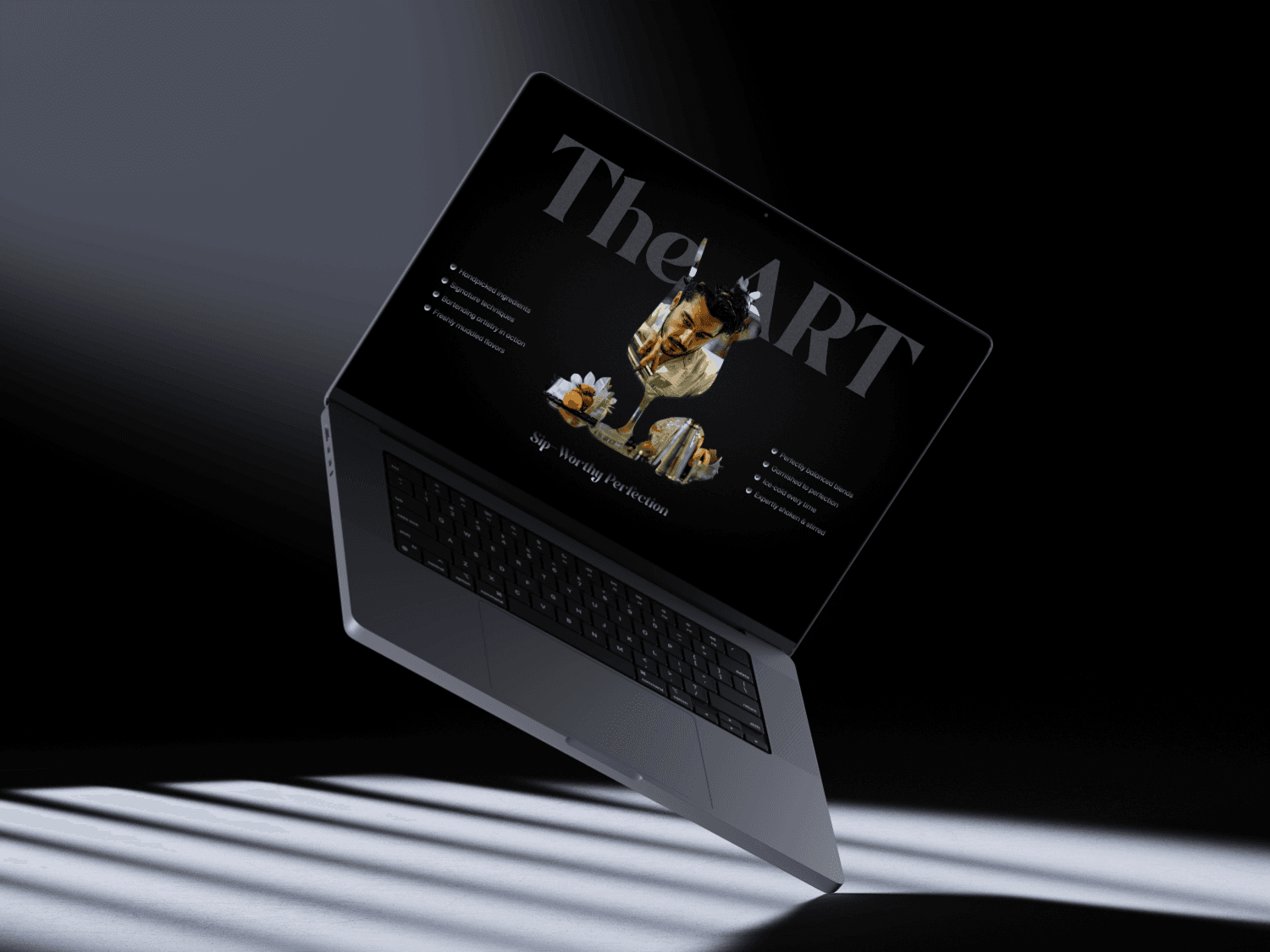
Homepage redesign: Created a hero section that immediately communicates value
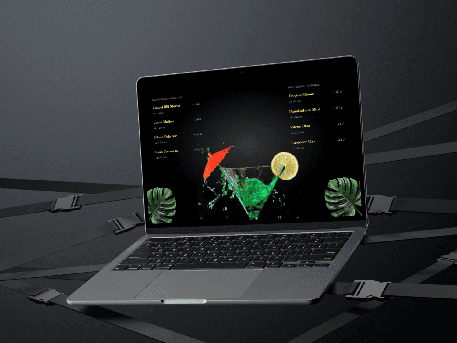
Category navigation: Organized cocktails by spirit, occasion, and difficulty
Mobile-first approach: Ensured every design decision worked beautifully on small screens
I created a few iterations, testing different layouts and interaction patterns. Each version got us closer to that effortless experience we were aiming for.

Key Design Decisions
Let me walk you through some of the specific choices that made the biggest impact:
Visual Storytelling Every cocktail needed to look as good as it tastes. We used high-quality imagery and made sure each recipe card was instantly appealing and informative.
Progressive Disclosure We didn't overwhelm users with information upfront. Instead, we revealed details progressively as they explored—keeping things clean and focused.
The Results
So, did it work? Absolutely.
After launch, we saw:
Increased engagement: Users were spending more time on the site, exploring multiple recipes
Improved ROI: The client saw tangible business growth from the redesign
Better user satisfaction: Feedback showed users found the new experience intuitive and enjoyable
But beyond the metrics, the real win was seeing users actually connect with the product. They weren't just finding recipes—they were discovering a passion for cocktails.
Lessons Learned
Every project teaches you something, and this one was no exception. Here's what I took away:
1. Speed Doesn't Mean Sacrificing Quality
With only three weeks, I had to be decisive. Skipping wireframes and going straight to high-fidelity designs worked because the research phase gave me clarity. Sometimes constraints push you to be more focused and intentional.
Users Know What They Want (If You Ask)
The surveys were gold. Instead of assuming what cocktail lovers needed, I asked them. Their answers shaped every design decision. Never underestimate the power of direct user feedback.
Design is Problem-Solving, Not Decoration
The prettiest design means nothing if it doesn't solve the user's problem. Every color, every button, every interaction had to earn its place by making the user's journey easier.
Context Matters
Understanding the cocktail culture—the excitement, the experimentation, the social aspect—helped me design something that resonated emotionally, not just functionally.
My Final Note:
Looking back, the Mojito project for Velvet Pour was a whirlwind three weeks of research, design, and iteration. But it reminded me why I love product design: the opportunity to transform frustration into delight, to turn confusion into clarity.
We didn't just redesign a website—we created an experience that understood and celebrated cocktail enthusiasts. And seeing those engagement numbers and ROI grow? That's the kind of impact that makes all the late nights worth it.
Here's to more projects that challenge us, teach us, and ultimately, make people's lives a little bit better, one cocktail at a time. 🍹Peace….

