Real Scout
Real Scout is a modern real estate mobile app that helps renters, buyers, and investors find their ideal properties without the usual headaches.

Challenge
You're apartment hunting in a new city, scrolling through endless property listings, trying to remember which one had parking, which one allowed pets, and whether any of them were actually in your budget. Sound familiar?
That's exactly the problem Real Scout users were facing. The existing platform was basically a digital phonebook of properties—no way to search by specific locations, no filtering options, and definitely no way to narrow down choices without opening every single listing. For someone looking to rent or invest in real estate, it was like searching for a needle in a haystack... blindfolded.
The core problem
Location, Location, Location (But Where?) Users couldn't search for properties in specific neighborhoods or cities. If you wanted something in Beijing, China, you'd have to scroll through listings from everywhere and anywhere.
The Filter Frustration There was no way to filter by price range, property type, number of bedrooms, or square footage. Every user had to manually sift through hundreds of irrelevant listings to find their perfect match.
Decision Fatigue Without proper filtering and search capabilities, users were overwhelmed, frustrated, and often abandoned their property search altogether.
Understanding the Users
Before jumping into solutions, I needed to understand who was struggling and why. I conducted surveys with renters, first-time buyers, and real estate investors to dig into their pain points.

What I Discovered
The survey responses painted a clear picture:
78% of users said they abandoned property searches because they couldn't find what they wanted quickly enough
Real estate investors needed to compare multiple properties across different price ranges and locations efficiently
First-time renters felt overwhelmed by too many options and wanted guidance
One survey response stuck with me:
"I spent 45 minutes looking for a 2-bedroom apartment under $1500 in downtown, only to realize half the listings I clicked were studios or way over budget. I gave up."
That's when it clicked—this wasn't just about adding features. It was about respecting users' time and helping them find their ideal home without the headache.
The Solution
I redesigned Real Scout from the ground up with three core principles: clarity, efficiency, and delight.
Before I started building anything serious, I had to sketch a couple of screens to get my thoughts in order.

Later on, I polished things up and transformed the sketches into proper, functional wireframes.
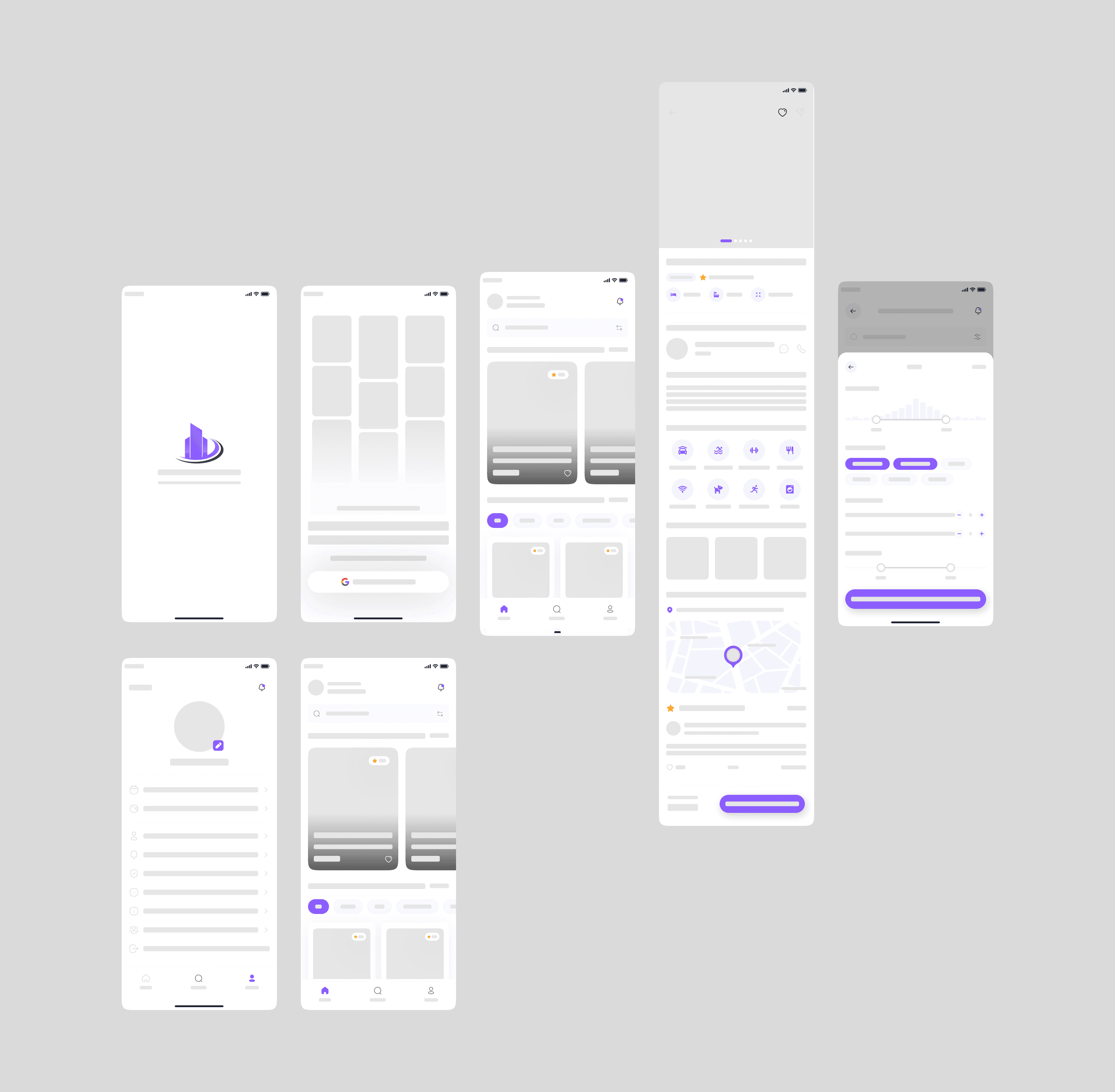
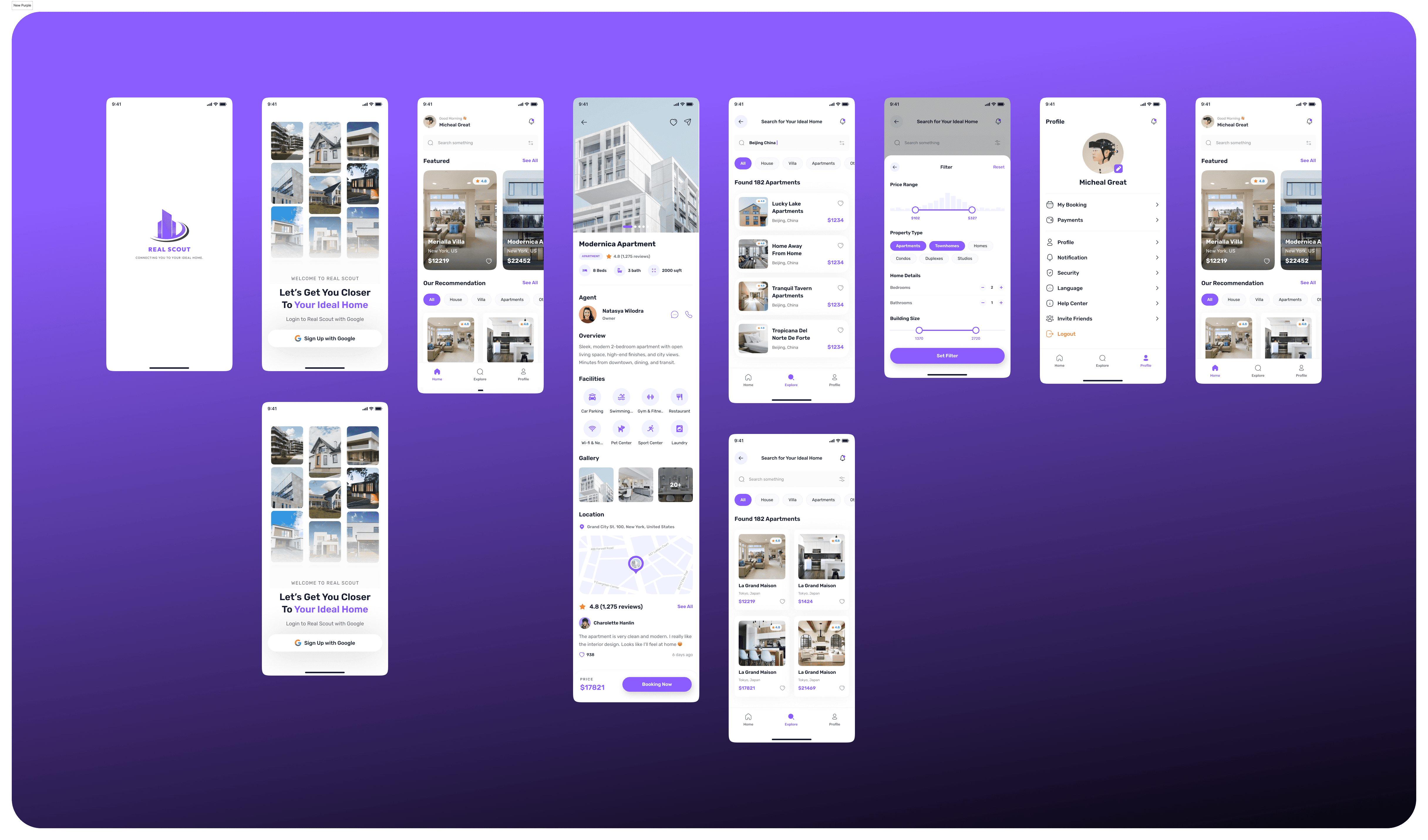
1. Location-Based Search That Actually Works
The first thing users see now? A prominent search bar right at the top. Type in "Beijing, China" or "New York, US" and boom—you're seeing properties exactly where you want them.
I added a clear location indicator on every screen so users always know what they're browsing. No more mystery locations or endless scrolling.
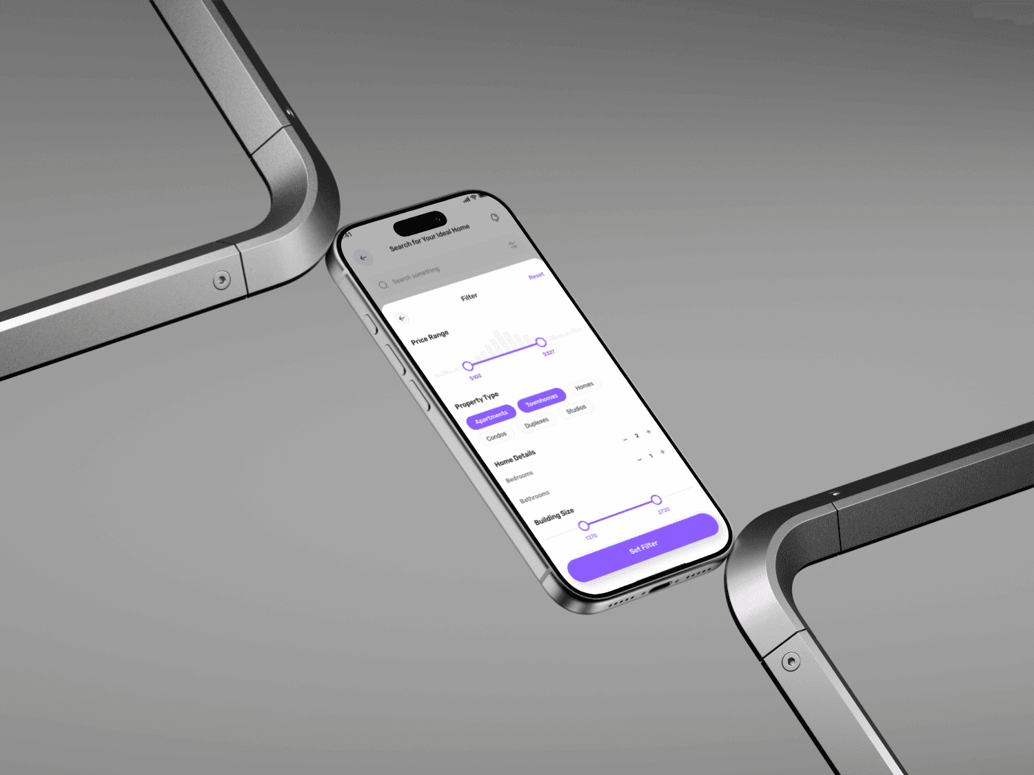
2. Smart Filtering for Smart Decisions
Here's where things get interesting. I designed a comprehensive filter system that doesn't feel overwhelming:
Price Range Slider: Visual, intuitive, and shows exactly what you can afford ($102 to $327 in the example, but customizable to any range)
Property Type Tags: One-tap selection between Apartments, Townhomes, Homes, Condos, Duplexes, and Studios. Selected options are highlighted in that signature purple, so you always know what's active.
Home Details Controls: Clean +/- buttons for bedrooms and bathrooms. Simple, familiar, and impossible to mess up.
Building Size Slider: For those who care about square footage (and let's be honest, investors definitely do), there's a dual-handle slider showing the range clearly.
Visual Hierarchy and Information Architecture
Every property card now tells a story at a glance:
High-quality images that make you want to book a viewing
Star ratings with review counts for social proof
Clear pricing in bold, purple text
Quick specs with icons (beds, baths, square footage)
Heart icon for favoriting—because everyone has a wishlist
Design Decisions That Mattered
Purple as the Primary Color: I chose a vibrant purple (#7B5EFF) because it stands out in a sea of blue real estate apps, feels modern and trustworthy, and creates visual consistency across all interactive elements.
White Space: Real estate can feel cluttered. I used generous white space to let properties breathe and help users focus.
Rounded Corners Everywhere: From cards to buttons to images—softness makes the app feel friendly and approachable, not corporate and cold.
Consistent Iconography: Every icon serves a purpose and uses the same purple accent color for instant recognition.

The Impact
After launching the redesigned Real Scout, the results spoke for themselves:
📈 43% increase in booking rate
Users went from browsing to booking because they could actually find what they wanted.⭐ 3.6/5 user satisfaction score
Survey feedback showed users felt "in control" and "confident" in their property search.⚡ 47% reduction in time-to-find
What used to take 45 minutes now takes users an average of 15 minutes.❤️ 2.8x more properties favorited
When users can filter properly, they find more properties worth saving.🎯 89% filter adoption rate
Almost 9 out of 10 users now use the filter feature within their first session.
Few Project Screenshots
NB:I got the green light to share this project as a case study, but not everything made it here. Some advanced features and internal metrics had to stay behind the curtain due to my agreement with the client.
Well, What I Learned
This project taught me that good design isn't about adding features—it's about solving real problems elegantly.
so, I learned to:
Listen deeply to user frustrations rather than assuming I know what they need
Prioritize ruthlessly—not every feature idea made it into the final design, and that's okay
Design for different user types simultaneously (renters vs. buyers vs. investors all needed slightly different things)
Conclusion
Real Scout went from being a frustrating property listing platform to a powerful search tool that users actually enjoy using. By focusing on location-based search and comprehensive filtering, I helped users find their ideal homes faster and with far less stress.
And honestly? That's what design is all about, making people's lives a little bit easier, one interaction at a time.

