Signalist

My job was to turn that mission into a clean, intuitive product experience—something even first-time investors would feel comfortable using.
The Challenge
Buying stocks can feel intimidating. Between candlesticks, terminologies, and market volatility, new users often feel lost before they even make their first trade.
Signalist wanted to solve this by:
Making stock buying extremely simple
Turning complex signals into everyday language
Creating a dashboard that’s welcoming, not overwhelming
Guiding new users while still serving experienced traders
Building a sense of safety and trust
So the question was:
How do we design a trading platform that feels friendly and calm—even when the market isn’t?

Understanding the Users
1. First-time Investors
Want to start buying stocks but don’t know where to begin
Need clear explanations
Fear making the wrong decision
2. Casual Traders
Buy a few stocks here and there
Want signals that are easy to interpret
Need quick, digestible insights
3. Intermediate Traders
Understand charts
Want clean data and fast analysis
Prefer a clutter-free workspace
Designing for this mix meant one thing: simplicity at the front, depth at the back.
Design Goals
From early discussions, we agreed on these essentials:
Make stock buying dead-simple
Provide market signals in plain English
Keep the interface calm and decluttered
Ensure transparency and trust
Create an experience that guides without overwhelming
These goals shaped every design decision.

My Process
1. Industry Research
I reviewed popular stock apps and signal platforms. The recurring issues:
Too much noise and data
Technical screens with poor hierarchy
Lack of beginner-friendly explanations
Complicated buying flows
Signalist needed to be the opposite—simple, warm, and confident.
2. Information Architecture
I structured the product around a straightforward journey:
Onboarding → Dashboard → Explore Stocks → Signal Details → Buy Flow → Portfolio
Each step had to feel natural and predictable.
3. Wireframing
Early wireframes focused on:
A clean dashboard
Clear “Buy Stock” pathways
Simple signal cards
Easy access to stock details
A step-by-step purchase flow
The goal: guide the user without forcing them to think too hard.
Key Features I Designed
1. Beginner-Friendly Onboarding
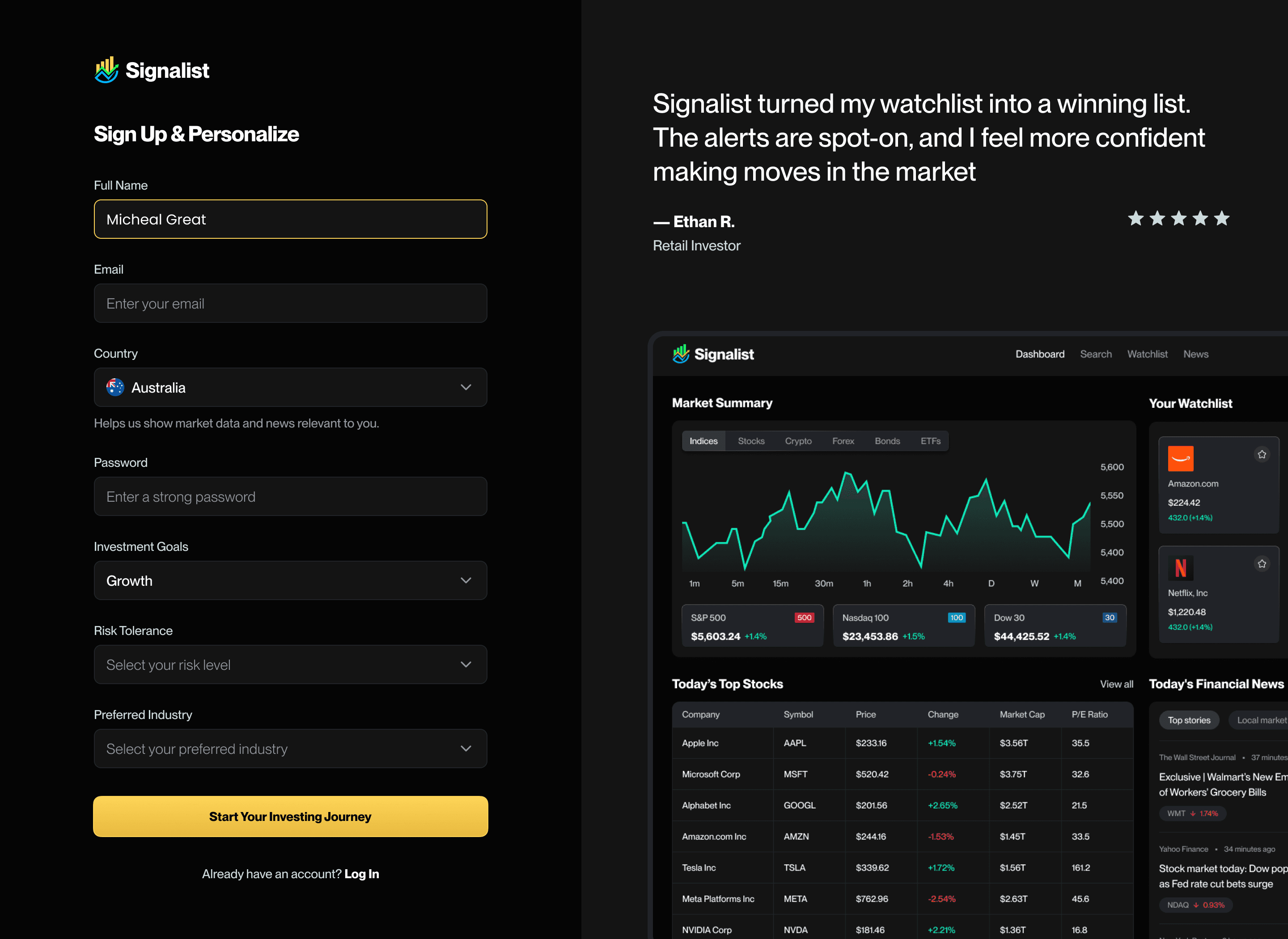

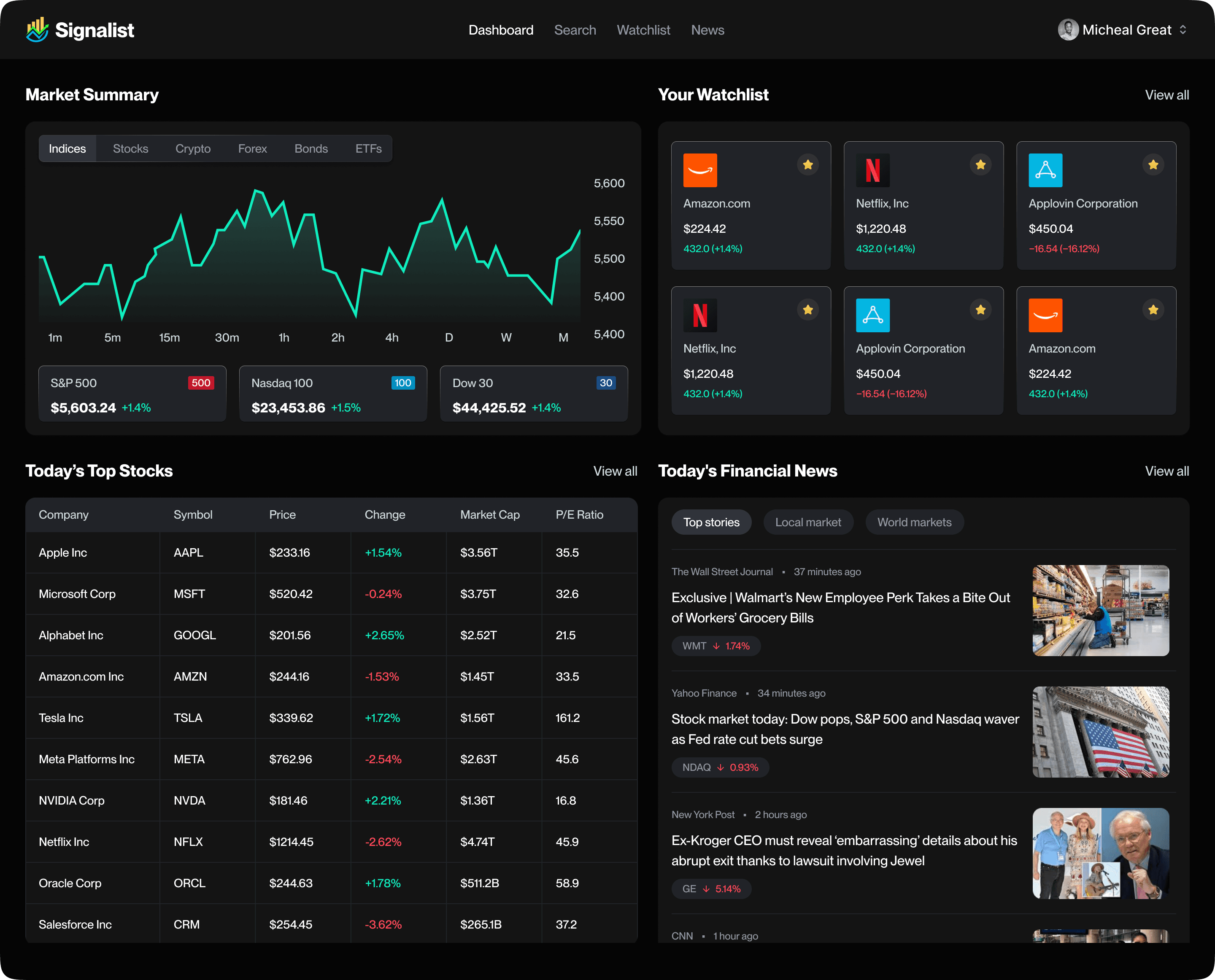
A Calm, Intuitive Dashboard
Shows:
Market overview
Trending stocks
Personalized suggestions
Quick access to your portfolio
Cleanly-presented trading signals
Everything the user needs—nothing they don’t.
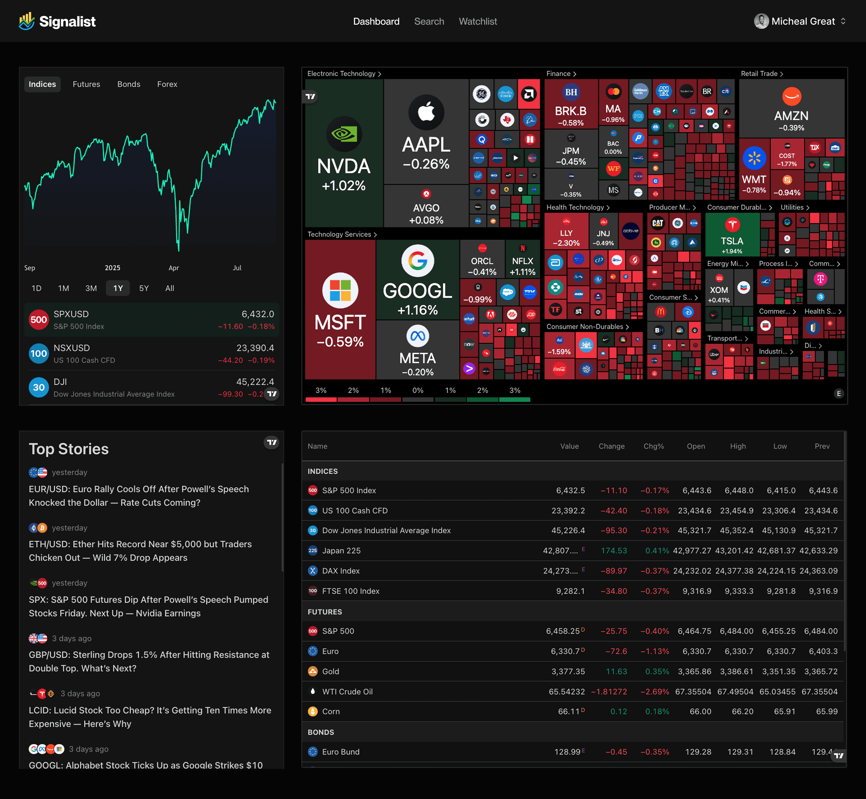
I created 2 variants of the dashboard, and we tested both to see the one that's gonna be preferred by the user.
Simple Stock Buying Flow
I redesigned the purchasing experience to be:
Step-by-step
Friendly
Error-proof
Users can:
Select stock
View quick insights
Enter amount
Review order
Buy with confidence
No clutter. No confusion.

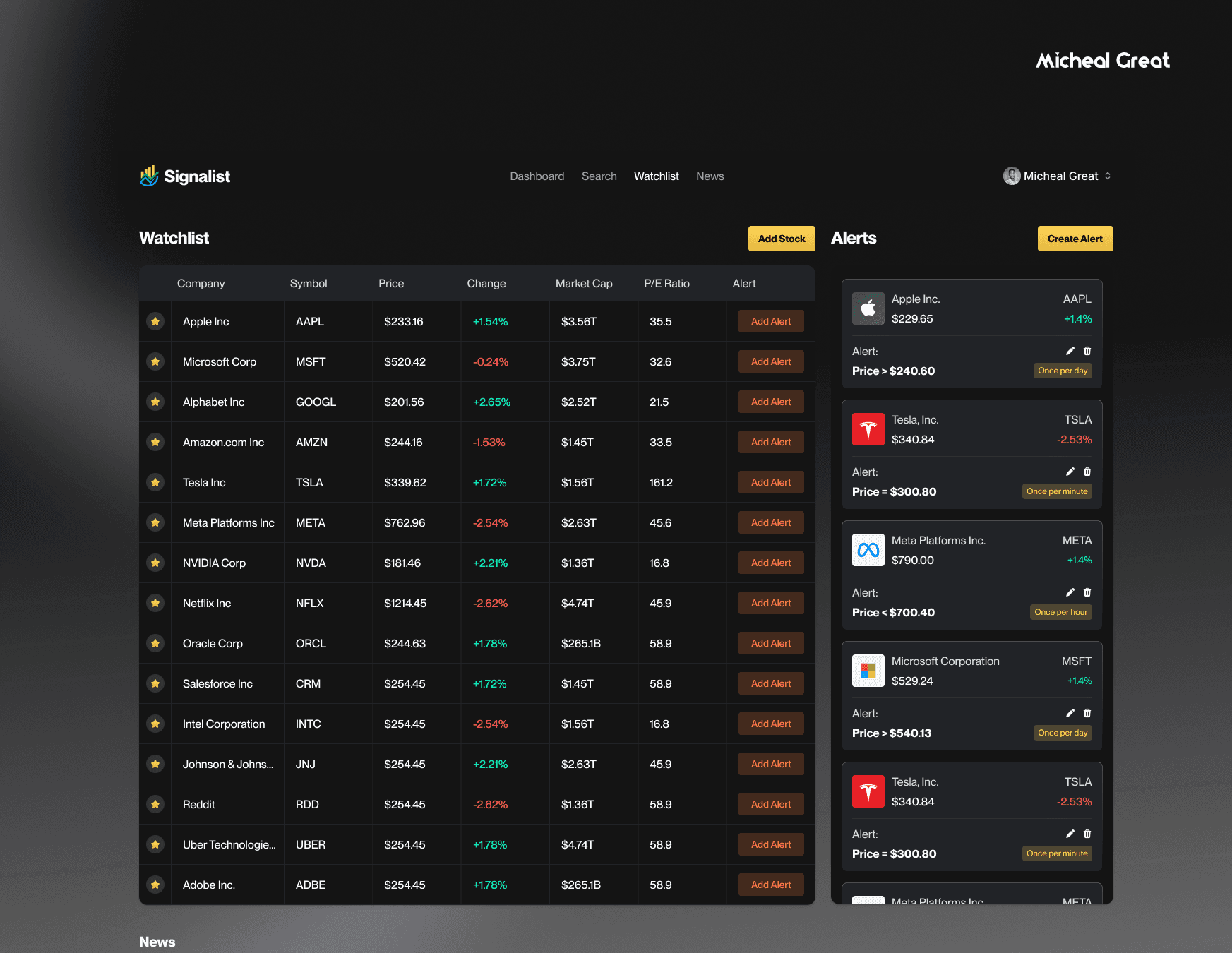
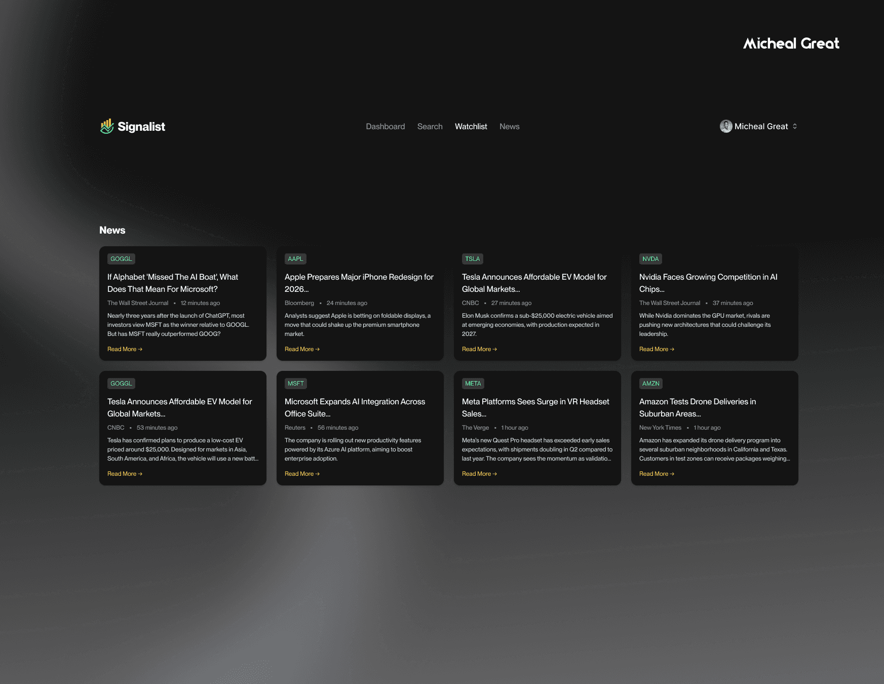
Watchlist — Track Your Favourite Stocks Easily
One of the major features I introduced was a simple but powerful Watchlist.
Users can:
Save stocks they’re interested in
Receive signal notifications for watchlisted assets
Quickly monitor performance at a glance
View price changes in real-time
Access watchlisted stocks from anywhere in the app
The Watchlist becomes the user’s personal “home base” for monitoring the assets they care about.
The Result In Short
The final product gave Signalist:
A clean, modern trading experience
A Watchlist that boosts user engagement
A signal system normal users can actually understand
A smooth, simple buy flow
A friendly and trustworthy overall feel
A complete design system ready for development
The client summed it up nicely:
“This feels like trading for regular people, not experts only.”
That tiny feedback honestly made my whole day. I love partnering with businesses, solving problems, and helping them hit their goals. It’s always a win-win for me.

